
Underglaze Painting
Learn to create rich, colorful surfaces on bone dry clay!
In this workshop, I discuss…
…my strategies for choosing what colors to use.

…how I consider the form of the pots while composing a dynamic surface.

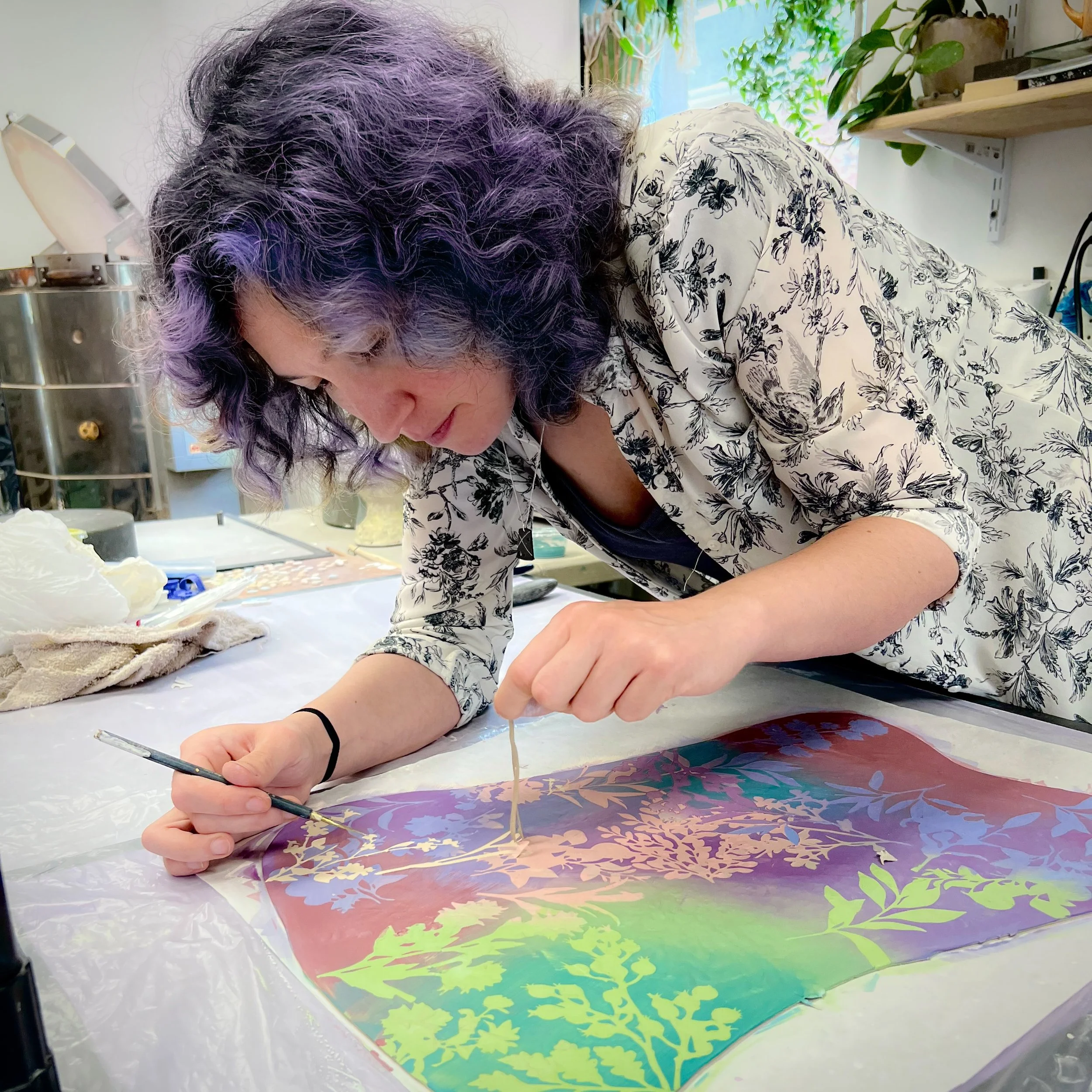
…how to paint subtle shifts between colors across a bone dry surface.

… my approach to removing or masking mistakes during the painting process, including freehand painting and scraping.

… my favorite tools for painting and touching up stenciled surfaces.
-
This question could be a whole workshop in and of itself. The short answer is that I design them by making a vector file of a high contrast photograph, drawing, or pressing of a plant into Adobe Illustrator. This file is then run through my Glowforge laser cutter’s software. I cut the stencils one sheet at a time to lower the chance that the paper could catch on fire.
-
I started putting layers of plant imagery on my pots in graduate school. For five years prior, I was spending an unbalanced overwhelming majority of my time in the school ceramic studios in Kansas and Nebraska. I was really missing walking in lush coastal woods (which were not in either state), being able to grow a garden, studying herbology, etc. I started collecting plants and pots to grow them in to line my window. Throughout the day, I would look at the shadow’s they’d cast on my pots on the worktable, see the way light filtered through their leaves, admire the juxtaposition of leaf and stem forms, find joy in watching them grow. They were and still are beautiful and interesting to me, and I want to share that sentiment through my work.
It is important to use imagery, symbols, textures, colors, forms, etc. that are personally meaningful to you through your work. The only way to figure out what that is specifically, is to examine the sights or moments in life that look or feel the way you want your work to look or feel.
-
I prefer using cheap newsprint paper for my paper resists because I work on bulbous, bone dry forms. I need the stencils to bend and adhere when damp. The permeability of the cheap paper fibers allows moisture to penetrate the paper and suction it to the dry, 3D clay surfaces.
If you are working with flat sheets of clay or leather hard clay, Tyvek can be a good alternative to explore if you are interested in trying to reuse your stencils.
-
If you have never tried using paper resists before, I recommend cutting out simple shapes either by hand using scissors or an Xacto knife.
If you know this is a method that you want to try with more complex shapes, then I suggest investing in a craft cutter such as a Cricut or Silhouette. There are many tutorials online for how to use one to cut paper, vinyl, tyvek, and more. Using this machine will save your hands.
I think a laser cutter is only necessary if you are really looking to commit to cutting stencils. They are expensive, but they cut more quickly than a craft cutter and without the need to change blades. I use a Glowforge.
If you have a local library or makerspace near you, they may have a craft cutter or laser cutter you could access as well.
-
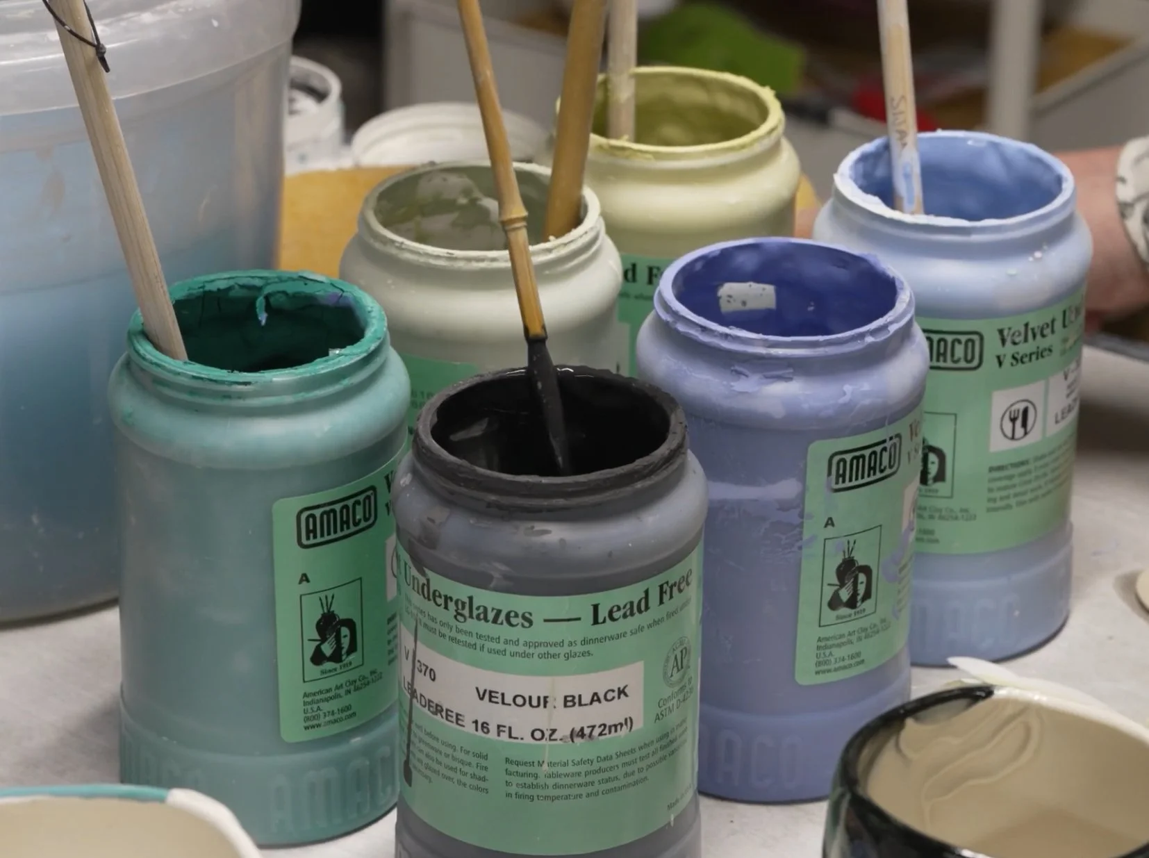
I am only experienced using this technique with Amaco Velvet Underglazes, but I don’t see why it wouldn’t be possible to layer gradients of colors made out of a different brand’s underglaze. The key is developing the ability to predict the end result. This requires testing underglaze combinations with your chosen glaze(s), regardless of which brand you choose.
-
Yes, this layering process is applicable to stoneware. I recommend porcelain or white stoneware for a more predictable result. You can also coat a darker stoneware in white underglaze or slip prior to painting.
I’ll say it again, you have to test in order to get a predictable result. Don’t skip practicing many combinations and taking notes (or photos!) about what you tried.
-
I have never used a moving commercial clear glaze that pulls cobalt, but I have heard that Mayco SW 001 and Laguna Infinity Clear pulls cobalt. Amaco recommended HF-9 Zinc free clear. Keep in mind, I have NOT tried these myself. So, if you know of one you would like to share or if you test any of these, please email me at taylorsijan@gmail.com and let me know how they worked for you!
-
To create several discernible layers, I typically choose the following intensities: 1-2 light/pale colors, 2 medium colors, and 1-2 darker/more saturated colors.
For Amaco Velvets, here are my favorites…
Light/Pale - ivory beige, sea foam, baby blue, pearl grey, lilac
Medium - deep yellow, pistachio, cactus, violet, lavender, salmon, coral, blush
Darker/Saturated - light red, bright orange, amethyst, teal blue, blue green, velour black
You will have to decide what colors harmonize or clash to give you the vibe you want. I tend to stick to analogous or complimentary color schemes.
-
In this video, I’m using…
Amaco Velvet Underglazes
Long-handled hake brushes
Liner brush made by Troy Bungart (bristles are approx. 1/8” in diameter and 1 1/2” long)
Xiem Tools Korean Atelier rake tool
Xiem Tools 1 - 1.5mm stylus tool
Newsprint paper
Big, yellow plumbers sponge
You can purchase these tools through my Amazon Storefront or through your favorite clay supplier.
-
Cone 04 to bisque and cone 6-7 to glaze.
-
They are recipes by Pete Pinnell and Jeff Campana. Download my clay and glaze handout to see the recipes. Click the button to the left (or above, if using a phone).
Frequently Asked Questions
Thanks for watching!
We hope that you enjoyed this video workshop and that it inspires you to get creative in your own studio!
We strive to create engaging educational workshops for interested makers. Please do not hesitate to reach out to Taylor with any additional questions, feedback, or suggestions! Your input helps us create better content in the future.
Taylor Sijan
Artist & Educator
TaylorSijan@gmail.com

Alex Carros
Video Producer
LightCharmStudios@gmail.com